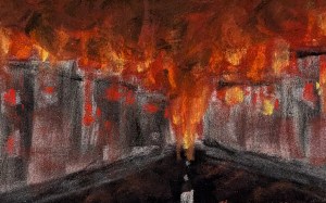
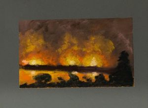
“Urban Warfare (world on fire)” pastel on pastelmat, 2024, 7″ x 9.5″
This piece is inspired by recent world events, global warfare, and the unsettling sensation that the world is on fire, which has begun to seep into my dreams. It’s not a coincidence that it is similar to “The Nightmare City”; it is a place I see often in my dreams. In my PTSD-fueled nightmares, I find myself on this street, looking up the road toward…what, exactly? The distance? What is beyond, I never quite find out, however long I walk – or run. Sometimes it helps to paint these images, sometimes it doesn’t.
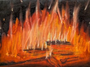
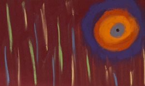
I’m enjoying exploring this theme of campfires – almost as much as I enjoy sitting by the fireside on a chilly evening in the darkness. This is one of those themes I’ll likely continue to play with until I get that feeling that I’ve “gotten it right” or said all I have to say about it, somehow.
I took a few days of dowtime on the Oregon coast to paint and reflect. Time well-spent, but I was missing a certain specific experience that I often indulge when I go camping in milder weather (this trip was a hotel stay, with a lovely view of Siletz Bay) – hours sitting by a campfire, just staring into the embers and listening to the flames crackle. I had it on my mind, and it proved to be sufficiently inspiring to try to capture that yearned-for moment in pastel.
“Stress” 3″ x 6″ pastel on Sennelier pastel card, 2024
Inspired by a year of stress, this piece is the first abstract work I’ve done in pastel. Small, because honestly stress doesn’t need a boost to feel huge.
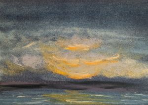
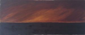
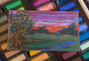
“Winter Sunrise” 7″ x 9″, pastel on Pastelmat, 2024
I sat down to paint, feeling the lingering fatigue of a busy week, and a little low, generally. My heart felt heavy with the weight of unexpressed concerns, mostly fairly abstract and unresolvable. This painting is inspired both by my heavy heart, and also by the awareness that a new day will dawn. I could have titled it “This Too Will Pass” and conveyed similar sentiment.
This piece is painted entirely with Blue Earth pastels, and on Clairefontaine Pastelmat, taking advantage of a new tabletop easel. It’s been awhile since I worked from an easel, and in pastel there are some definite advantages, one being that loose pastel dust falls away from the work immediately, reducing the risk of smudging it into the work in spots where it doesn’t belong.
Some folks – maybe a lot of people – are hurting right now. Feeling angry. Feeling devalued. Feeling that their voice doesn’t matter. Feeling powerless. Hard times are… hard. Hard times make great art. Always have.
…The world feels like it’s on fire, and there is war and destruction everywhere…
When I came home from Desert Storm, my painting style had changed (rather a lot), and the things on my mind began to percolate up through my art. I painted the war. I painted the chaos. I painted the things I didn’t have words for. I’ve used art to give voice to the things I don’t have words for “all along” – at least for the whole time I’ve been an artist.
“Kuwaiti Oil Fires” 20″ x 48″ oil on stretched silk, 1991
Shortly after I returned from the war, I gave up oil painting entirely, in favor of acrylic and pursued an abiding fascination with abstraction, and the use of nontraditional pigments and mixed-media elements in my work.
… And events just kept delivering hard times and trauma to reflect in art…
“9-11″ 18″ x 24” acrylic on canvas, 2001
Hard times come and go. Trauma is inflicted and endured, and trauma heals. The art remains.
I guess I’m just saying inspiration comes in many forms. Sometimes a beautiful sunrise on a favorite trailhead is enough. Sometimes events and circumstances provide inspiration of a different sort. I don’t know what to expect of my work from here, I only know I’ll keep feeling – and painting.
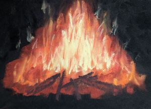
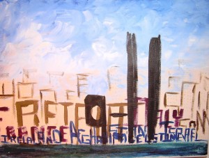
“Drone Strikes” 5″ x 7″ pastel on pastelbord, 2024
“Sunrise at the Trailhead II” 5″ x 7″, pastel on Pastelbord, 2024
I take a lot of early morning hikes. I see a lot of sunrises. No suprise then that I also paint a lot of sunrises. This view is a favorite one, from “my” parking place at a favorite trail. I see the sun rise from this vantage point often. This colorful sunrise, a view seen in September (as I recall) was quite a splendid one, and I did my humble best to capture it, although there is no universe in which art could accurately convey the beauty of the colors I saw that morning. I’ll keep trying. I’ll keep wondering at those beautiful sunrises.
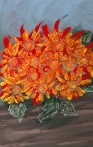
“Fall Chrysanthemums” 5″ x 7″, pastel on Pastelbord, 2024
A pot of autumn chrysanthemums on a table inspired this piece. I enjoy using the bright hues of yellow, orange, and red pastels. There’s something fun and freeing about painting flowers, and an innocence and simplicity the riot of bright colors. Flowers seem somehow undemanding and joyful, and of all the pieces I’ve recently painted, my eyes keep coming back to this one.
I chose my first soft pastels with care, but also with limited experience (and I’m still quite new to pastels as I write this). I’ll admit, too, that one detail important for me personally was not related to the look or feel of using the pastels, nor to do with the pastels themselves, directly; the history of the brand. The legacy. The way they have withstood the test of time, and the other artists who have used them. No surprise, then, that two French brands stood out for me, and ended up being early choices for me in this medium, eh? Sennelier and Henri Roché.
Sennelier has been around awhile, too, and is a definite “workhorse” of a soft pastel brand that many many artists of note have used. There’s a sense of continuity in using them, beyond their good general quality. They’re also pretty commonly available at art supply stores.
I like both of these brands, not only for their history, but also for how they feel, and the look of them on the page. The colors have good durability, and lay down well. They feel soft and smooth in my hand without falling apart easily, with some specific pigments in each brand having some variance (sometimes a bit gritty, other times a tad dusty, and it seems more to do with the specific pigments being used and less about either brand generally). I love the colors.
One thing about both these brands, though, is that they’re made in France. By itself this isn’t a problem at all, it just comes with a catch; it’s not always easy to find or obtain some specific individual color quickly, and I’m not always looking for a set. There are occasions when I’m not willing to sacrifice inspiration in the moment to wait on a package to arrive. These can be costly, too (and let’s be frank, the Henri Roché pastels are the Lambo of soft pastels – they have the price to prove it – and everything else that seems “expensive” is quite reasonable by comparison). I’m not really giving price much thought, here, I’m just making a point to identify this as a potential concern for most artists.
I do want to talk about how these compare to an American brand of very similar reputed quality. I’m trying this brand for the first time; Blue Earth pastels. There’s not much history here (made since 2012), so “legacy” details aren’t a factor, but I’d heard they’re very good quality and couldn’t find a direct comparison between the Henri Roché pastels and these. I’ll be comparing these three brands for my own benefit, and deciding whether to continue to use all three, or pare things down to two favorites over time (it’s a personal preference; I don’t prefer to have a wild random assortment of different brands in the medium I use). There don’t seem to be many comparisons of these brands to each other, so I’m sharing my thoughts.
I’m hoping to make a decision which brand will form the foundation of my palette long-term, versus being relegated mostly to accents, highlights, fun stuff, and specific projects or unique colors. (I did say I’m not focused on price, but… I’m also not made out of money. lol)
Here’s what I’ll be comparing:
Color characteristics
How they feel in my fingers
How they lay down on the surface I’m using
How much dust they make in regular use
How easily they smudge and blend
How much I enjoy using them in general (which is quite subjective but matters most to me personally)
Shall we get started?
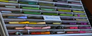
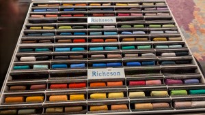
This is my current selection of Henri Roché pastels:
My Henri Roché pastels photographed in a state of chaos in my Roz Box (after a mishap resulted in spilling them to a tabletop).
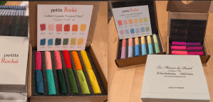
I don’t have many of these; I buy them “as a treat” now and then or for a particular project that just wants that special something. There are currently 1958 available colors, total (wow!). I purchased these as small half-stick assortments, (and there are several really nice ones to choose from), and selected a small custom assortment of full size sticks in green hues which use pigments I favor (cobalt, chromium, and cadmium). I purchased them directly from the manufacturer’s website, but they are also available from a US vendor online, here.
Three half-stick assortments that got me started with Henri Roché.
Color characteristics – Color-wise, the Henri Roché soft pastels are amazing. Unmatched pigment saturation and there are so many beautiful hues to select from! I love the way each color has a selection of tints and shades from full saturation to the lightest most delicate tint. I never regret choosing colors from this brand.
How they feel in my fingers – The pigment is quite fine, and minimal binder is used in these. They aren’t “powdery”, nor are they “chalky”. They have a dry, firm, feel without being brittle in use. Some specific pigments seem slightly more “coarse”, with a somewhat rougher feel. I’d call these generally “fine”. They feel soft and smooth in my fingers. These are slim round sticks, well-crafted (by hand) with excellent consistency of shape and density.
How they lay down on the surface I’m using – These pastels lay down dense even color on the surfaces I prefer (usually pastelmat or pastelbord). They don’t tend to flake at all, and the dust produced isn’t excessive or super powdery. They adhere well to a surface.
How much dust they make in regular use – meh. “Normal dusty”? These pastels are very much my idea of… Ideal.
How easily they smudge and blend – these pastels smudge and blend well when approached with intention. I find that they don’t seem prone to “casual smudging” that can easily muddy a very colorful piece of work, which is nice.
How much I enjoy using them – truthfully, I love using these, and if it were a “cost no object” sort of world I’d have the complete set, and none other.
This is my current selection of Sennelier, (mostly purchased as a set):
My selection of Sennelier soft pastels, photographed in my Roz Box, rather randomly placed.
There are currently 525 shades listed available on their website. My original set was a set of half-sticks, but new colors have been purchased from their open stock full sticks. These are very easy to come by, and even the larger sets are quite affordable and available online and in local art stores. The paper wrappers on the full sticks are a pain in the ass to remove.
Color characteristics – these pastels have good saturation and and a good selection to choose from. They’re readily available in good sized sets with enough variety to really get started (which is how they ended up being my first pastels).
How they feel in my fingers – I’d call these “medium fine”. They have an amount of binder consistent with most professional brands of soft pastel, and feel dry and soft-ish in my fingers. They are more prone to flaking than the Henri Roché pastels. They don’t tend break in normal use. They are not particularly even in size or form (half sticks), and the wrappers are a serious annoyance (full size sticks). These are round sticks, and considering the volume they sell, it’s not a surprise that modern manufacturing techniques and machines are used to make them. They often have little air pockets here and there.
How they lay down on the surface I’m using – these pastels lay down a good bit of pigment but only as evenly as the stick itself is well-shaped. These benefit from some attention to the side or edge I plan to use before I proceed.
How much dust they make in regular use – these seem a bit less dusty than either the Henri Roché or the Blue Earth pastels. This probably has to do with the specific binders used and the relative coarseness of the pigment particle size. I’ve got to use quite a bit of pressure to create a lot of dust with these. They’re pretty easy to vacuum up or wipe from a tabletop.
How easily they smudge and blend – these smudge decently well without excessive muddying, but don’t blend as well as the Henri Roché pastels. This may be something to do with how various shades are created or the binders used. I started with these, though, and I’ve learned their ways. lol
How much I enjoy using them – these pastels are suitably pleasant to use. They’re sort of a “Honda Civic” (my opinion) – reliable, comfortable, conveniently available, but they aren’t an “effortless experience”, nor are they “luxurious”. I probably used the right phrase earlier; “workhorse”. I use them a lot, and often reach for them first when I set up the palette for an individual piece, and if not first, I end up grabbing one on the fly, in a moment of inspiration.
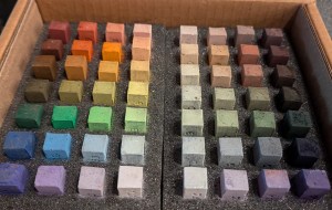
Here’s the new selection of Blue Earth pastels, to consider:
The newly arrived assortment of Blue Earth pastels, the Nomad 56 selection.
The “full set” of colors available on the website includes 336 colors, but does not include the 21 darks that are also available (so, 357 in the line, total, as of writing this). The individual sticks are square, with precise “sharp” edges when they arrive, very flat sides and about “half stick” sized. These have less availability, but are easy to order online, although several of the assortments are often on back order.
Color characteristics: the pigment seems pretty dense and concentrated, with a reasonable amount of binder (not too much, and they don’t end up seeming chalky at all).
How they feel in my fingers: The surface of these pastels is very silky smooth and soft. I’d call them “very fine”. These are quite square with good symmetry and very consistent shape. I don’t have any information about the specifics of how they are made.
How they lay down on the surface I’m using: These pastels lay down a relatively thick amount of pigment without much pressure, and blend nicely. There’s some flaking, not a lot, but this can drop occasional chunks of pastel in spots I didn’t expect (or want) it to be.
How much dust they make in regular use: I’d characterize these as relatively “dusty”, due to the very fine pigment. After doing a small “test piece”, I found little drifts of dust here and there out of sight that I didn’t expect when I was tidying up. If I were going to make these my primary pastels, I’d certainly want to consider using a mask or respirator, as it seems likely there’d be quite a bit of dust ending up in the air, too.
How easily they smudge and blend: these pastels smudge and blend very easily, that was definitely a fun part of using them. I also found that I reliably had to go back over several areas to add more pigment, as the process of blending and smudging also removed more than I anticipated.
How much I enjoy using them: these are very pleasant to use. I don’t personally care for the vertical storage of the box they come in for actual use; they’ll end up in my Roz Box, in a section of their own, or in some other case similarly set up for laying them out horizontally. They behave quite differently (in my hand) than the French pastels I’m more used to. Mixed feelings, for me, and I’m a bit undecided.
This comparison is more difficult than I expected, when I consider my goal of settling on a preferred brand for my pastels, generally. I find myself yearning to embrace Henri Roché with a “cost no object!” battle cry, and having to admit that may be unrealistic. I haven’t yet used the Blue Earth pastels enough to be certain whether I could ever replace the Sennelier pastels with those, although I find myself considering it because the manufacturing quality stick-by-stick is clearly better. I think I want to spend more time painting with them before I decide – but that’s the direction I’m leaning.
I give some thought, too, to making a decision from a “use case” perspective, meaning to say perhaps I could relegate the conveniently square, compact, Blue Earth pigments to an assortment intended specifically for travel or plein air painting, and tuck them into a French easel drawer with that in mind? They are quite lovely. I’ve quite a lot to think about.
(My) first piece (ever) using the Sennelier soft pastels.
A similar piece using the Blue Earth soft pastels.
Hopefully putting my thoughts and observations into words is helpful for you in some way, as you consider your options from among the many choices of soft pastels available to you. Thanks for reading!
December 23, 2024 Update:
I’ve been continuing to paint with my combination of Henri Roche, Sennelier, and Blue Earth* pastels, and it seems like a good time to make an update. *The TL;dr is simply this – I don’t find find myself reaching for the Blue Earth pastels very often. Hardly at all, actually. It seems worth saying so.
I want to be very clear that art being what it is, some of the choices an artist makes are purely preference. There’s nothing “wrong with” the Blue Earth pastels at all. Great pigments, and they lay down well. They feel good in my fingers when I’m using them. I just don’t reach for them, even though they are right there in my Roz Box with my Sennelier pastels, conveniently within reach any time. I don’t choose them. Now and then I sort of “make myself use them”, and I’ve committed myself to going ahead and “using them up” to make room in my box for more Sennelier sticks, which I definitey reach for again and again (my HR pastels are in their own Roz Box). I’ll go out of my way to grab a particular Henri Roche color. I rely on my Sennelier pastels day-to-day. Somehow, for some reason, in my particular practice of pastel painting, I just don’t put the Blue Earth pastels to use very often.
I don’t have much insight to offer. It could be the shape? It could be the extra soft softness of using them. It could be the additional dust. I just don’t know. I don’t use them with the comfort and ease with which I use the Henri Roche and Sennelier pastels. It is what it is. They’re lovely, and some other artist may adore them – with good reason. That artist isn’t me.
I spent some hours recently thinking over which additional hues I want to add to my palette – and in every case those will be Henri Roche pastels. I’m not so fortunate as to be able to casually drop thousands of dollars on pastels (very few artists are), so the Sennelier pastels help fill in a lot of my palette with “day-to-day” hues. These are the pastels I use. I’m okay with that.